100 Dagar – Visual identity
Graphic design / Identity
About the project
100 Dagar is Norway’s smallest music industry festival, dedicated to championing new bands and artists from the south-west and west of Norway. The festival is a platform for newcomers, helping artists take their first steps into the professional music world.
I designed the visual identity to reflect that same spirit: bold, young and full of energy. With strong complementary colours, playful compositions and expressive typography, the identity captures the raw creativity of the new artists it represents. My goal was to cut through the visual noise of the cityscape and turn every poster into a statement that grabs attention and sparks curiosity.
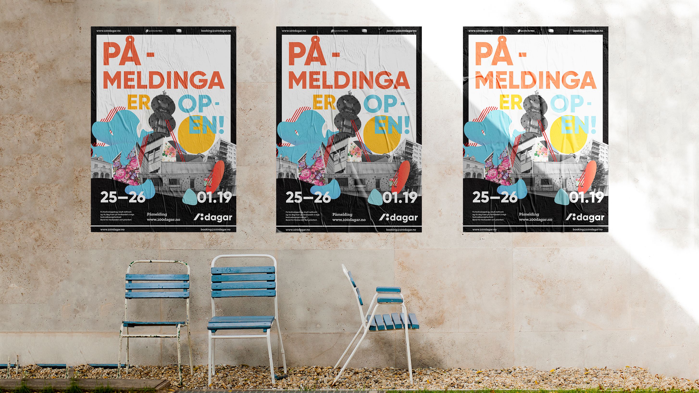
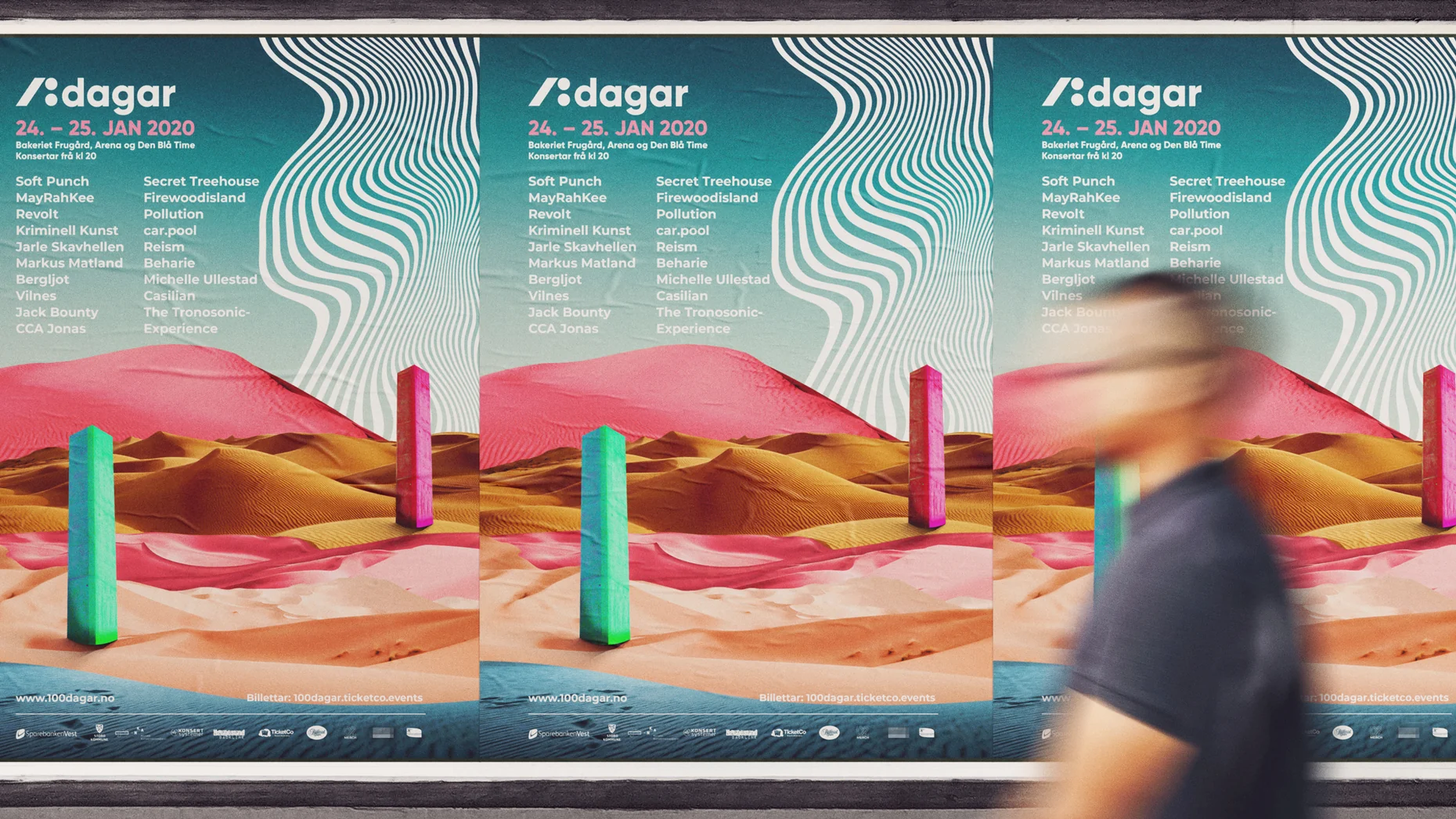
From a graphic design perspective, I wanted the identity to feel loose and spontaneous without becoming random. Behind the playful surface is a clear set of rules for colour, type and composition, which gives me room to experiment while keeping every piece recognisably 100 Dagar. The typography does much of the heavy lifting, working as both image and information, so the posters feel alive even before you read them.
From a UX perspective, a poster is an interface people meet in passing, often for just a few seconds. I therefore paid close attention to visual hierarchy, making sure the essentials, such as the festival name, dates and venue, remain easy to find and read within the expressive layout. The poster’s first job is to stop people in their tracks; its second is to tell them clearly what, where and when.
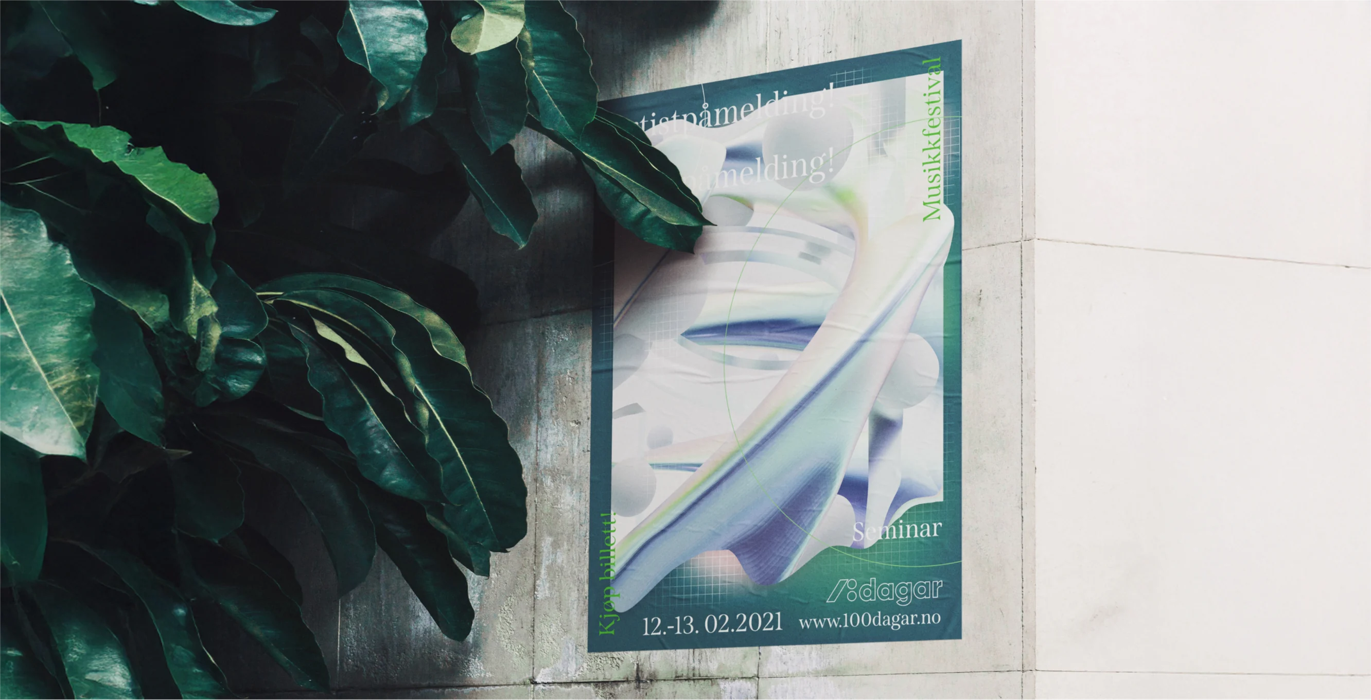
The three poster layouts show how the identity adapts to different formats while keeping a clear and consistent expression. Each variant balances recognisability with creative freedom, keeping the brand visually engaging without losing its core. This adaptability not only ensures visibility in different environments, but also strengthens the festival’s connection with a broad creative audience, from musicians and music lovers to the local communities the festival hopes to inspire.