Amedia – Website
UX design / Website
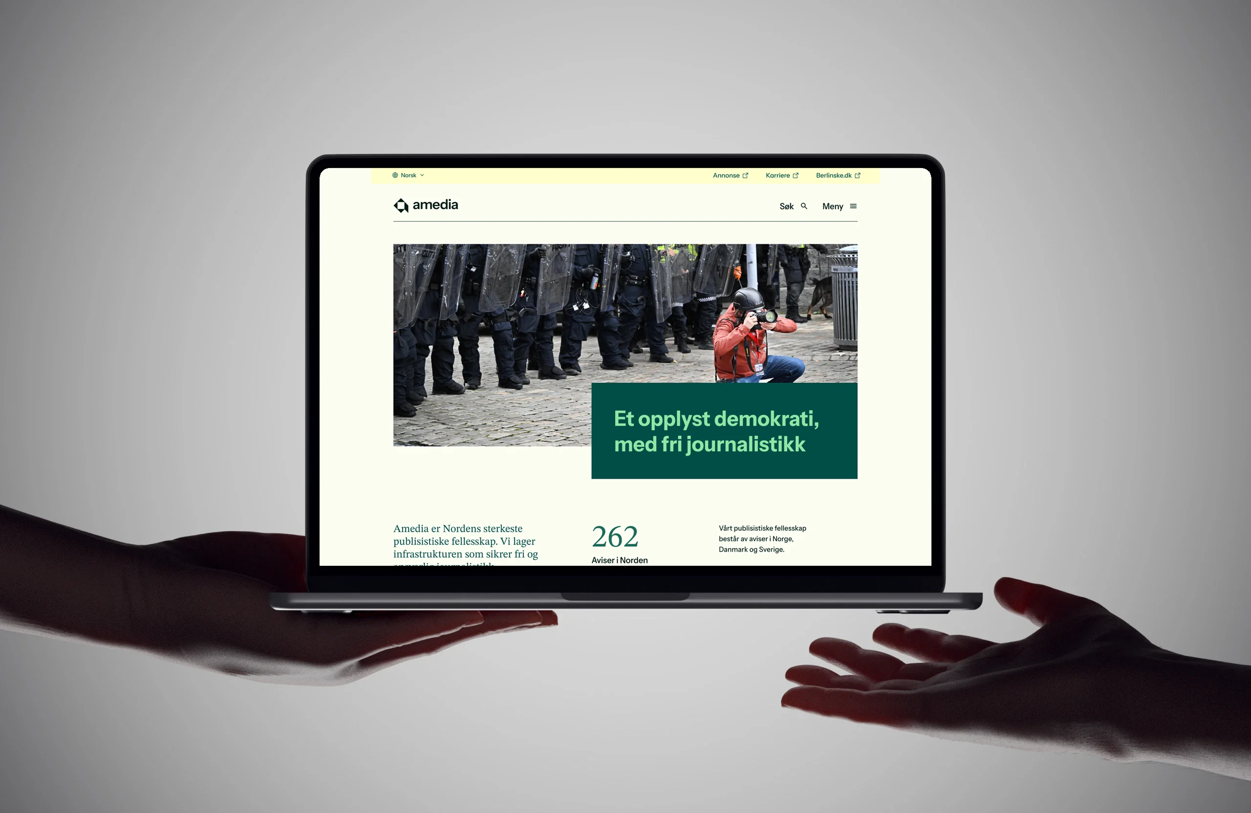
About the project
Amedia is Norway’s largest newspaper publisher and a leading Nordic media group, owned by the non-profit Amedia Foundation. Amedia’s mission is to safeguard local, independent journalism, and the company is driven by a belief that local voices must continue to be heard. It is the small, the local and the great diversity of communities that shape the culture of the Nordic countries, and Amedia is committed to protecting that.
Despite its size and importance, Amedia lacked a clear identity. A rebrand developed by another agency in 2024 had introduced a new visual direction, but had not landed several strategically essential questions: Who is Amedia, and what does the company want to communicate to the people who visit its website?
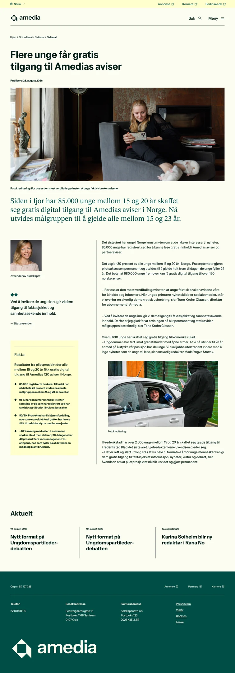

The answer is not simple, because Amedia plays several roles at once. It is an informant and a gateway to its many local newspapers. It is an advertising partner offering access to a large network of local audiences. And it is an employer and a career portal for a broad network of newsrooms and companies. Each of these audiences arrives with different expectations and different tasks, and the existing site did little to help them find their way.
Our job was to bring structure to the content, guide users to their most important tasks based on research and strategic work, and develop a new visual universe that would work across Amedia, its subsidiaries and its wider network of brands. We worked as a small, cross-disciplinary team of designers, a content designer and developers, and I was involved across every part of the process, from strategy and structure to visual design, content and prototyping.
We started by clarifying the site’s purpose and audiences. Through insight and strategy work, we identified the key user tasks, such as finding a local newspaper, exploring advertising opportunities or looking for a job, and used them as the backbone of the information architecture. Rather than organising content around Amedia’s internal structure, we organised it around what people actually come to do, making the most important paths visible and easy to follow from the very first screen.
The concept, which we called “the editing website”, draws directly on what Amedia does best: prioritising what matters. Just as a newsroom decides what makes the front page, the website itself makes editorial choices. We designed a scroll-driven bento grid where modules grow and shrink as the user moves down the page, visualising how content is weighed and prioritised. The result is a corporate site that doesn’t just talk about journalism, but behaves like it.
To bring the concept to life and test it early, our developers built interactive HTML prototypes, while I worked closely with them on motion, pacing and hierarchy. This made it far easier to evaluate the experience with the client than static sketches alone. We also explored tools such as a newspaper and location search, helping people quickly find the local papers connected to the places they care about.
Visually, our goal was to give Amedia an identity that feels confident and warm, with the credibility of a serious media group and the closeness of local journalism. I led the work on developing the visual language, building on a diamond-shaped graphic system and a distinctive palette of cream, dusty pink, forest green and deep red, and shaping it into a flexible system that can scale from the corporate site to subsidiaries and partner brands. Typography, grid and colour work together to create a clear hierarchy, while the diamond motif gives the brand a recognisable signature that ties everything together.
UX perspective
From a UX perspective, the core of the work was reducing ambiguity. Visitors should immediately understand who Amedia is, what the company offers them, and where to go next. Clear navigation, task-based entry points and consistent components make the site predictable and easy to use, whether you are a reader, an advertiser or a job seeker. Language played just as important a role as layout: our content designer reworked the site copy to make it clearer and more direct, and I contributed with advice on how text and design could work together to support the user’s tasks.
Design system and brand guide
To make the identity sustainable over time, we structured the work into a design system in Figma, including a cross-site rules page that serves as a brand guide for everyone working with the Amedia brand. This ensures consistency across web and mobile, makes it easier for teams across the organisation to build on the identity, and gives Amedia a shared foundation for future development.
The result is a website and visual identity that finally give Amedia a clear voice, one that reflects its mission to keep local journalism strong and local voices heard.