Bærum Kommune – Website
UX design / Website
About the project

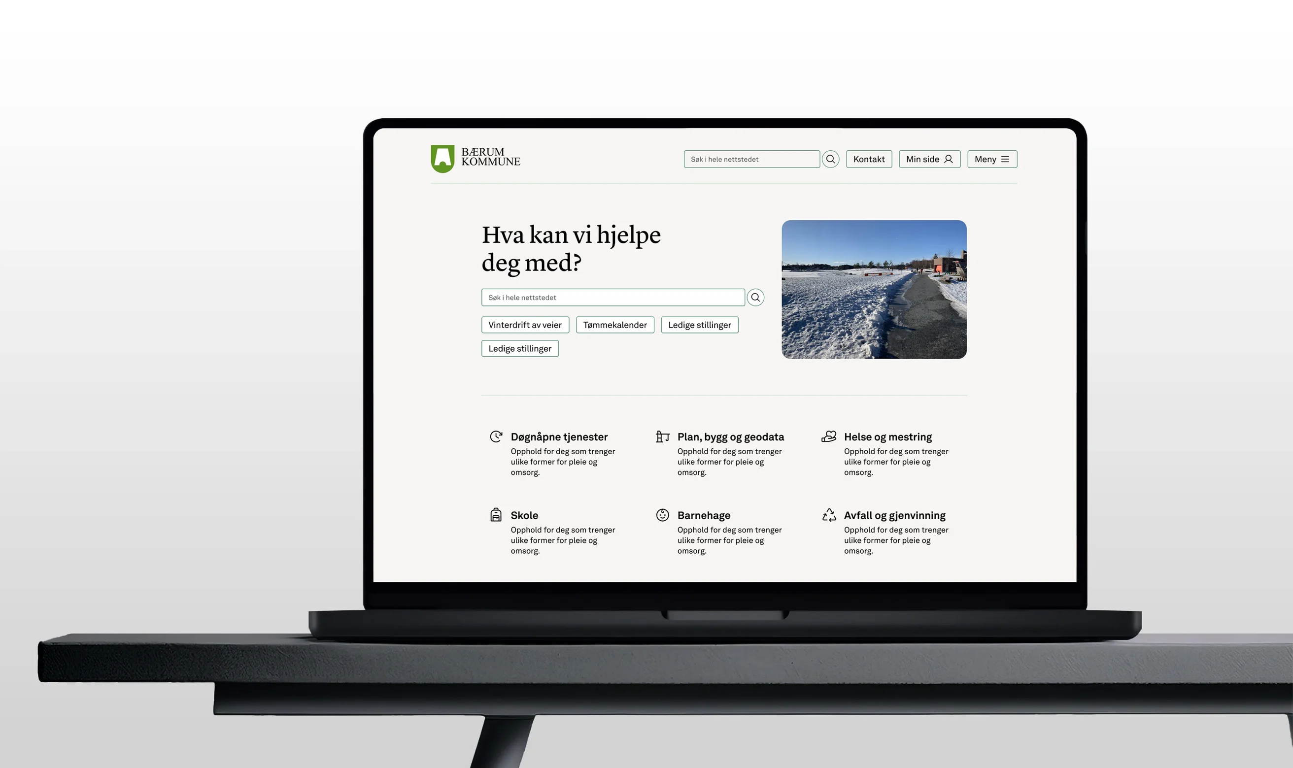
Bærum Municipality’s website shares information about municipal services, politics, culture and job vacancies. It is a shared arena for residents, the place people go when they need something from the municipality, whether that’s reporting an issue, finding an application deadline or reading up on a service.
That is exactly why the site has to be easy to navigate, and why it has to feel like one municipality, not hundreds of different senders who just happen to share the same logo.
Bærum Municipality was to keep its existing CMS, but give it a new and upgraded look. In practice, this meant cleaning up several thousand subpages and mapping how the various components were used across the site. Much of the work was about bringing order to something that had grown large and unwieldy over time.
Another equally important challenge was to gather all of Bærum Municipality under one shared umbrella, with a clear and trustworthy identity. The sender has to be front and centre. Residents should never be in doubt that it is the municipality speaking.
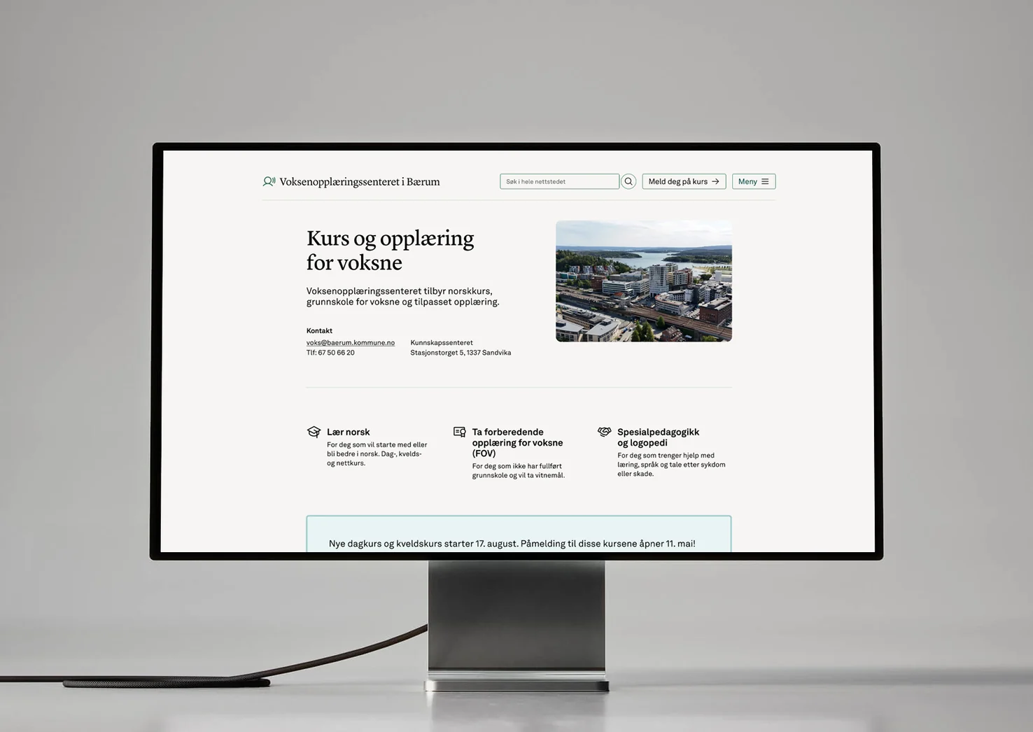
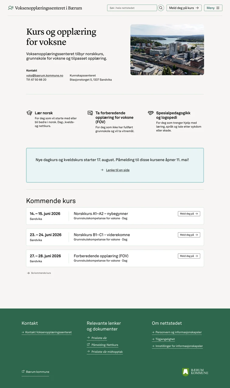
I had primary responsibility for redesigning the school pages, the Adult Education Centre and the Knowledge Centre. These services have different audiences with different needs for information and functionality, so the work required a thorough understanding of users’ situations and how information can be structured to be easy to find, understand and use.
As part of the design process, I mapped the existing components and content structure in Optimizely. The goal was to understand how the solution was used across the organisation, identify overlapping functionality and uncover areas where similar needs were being solved in different ways. This mapping laid the foundation for standardising and further developing the component library, making both the user experience and content management more consistent.
From a graphic design perspective, building a unified identity was largely about discipline and systems. I worked with typography, spacing, colour and visual hierarchy to give pages a shared rhythm and expression, so a school page and a page about adult education would clearly belong to the same family while still serving their own purpose. Consistent use of the municipality’s visual identity was key to establishing the sender: when the design language is coherent, trust follows.
From a UX perspective, I focused on how people actually arrive at and move through the site. Many users come with a specific task and little patience, often from a search engine, landing deep in the structure rather than on the front page. That made clear information architecture, predictable navigation and plain, scannable content essential. I also treated the content editors as users in their own right: a component library that is intuitive to work with makes it easier for editors to publish well-structured content, which in turn improves the experience for residents.
To make sure the solutions met real needs, I carried out user research with both content editors and representatives of the target audiences. Conversations with editors provided valuable insight into workflows, challenges and needs related to publishing content, while involving users helped validate structure, navigation and the use of components. These insights were actively used in concept development, prioritisation and design decisions throughout the project.
My deliverables included user research, component mapping, concept development, wireframes, redesign of key user interfaces and further development of components in the design system. The work contributed to a more cohesive digital identity for the municipality, better reuse of components and a clearer, more intuitive experience for both residents and content editors.