Zalo – En dråpe er nok
Graphic design / Campaign
About the project
Zalo is a Norwegian dishwashing liquid produced by Orkla. It has been on the market since 1951 and is one of the most recognised brands in Norway.
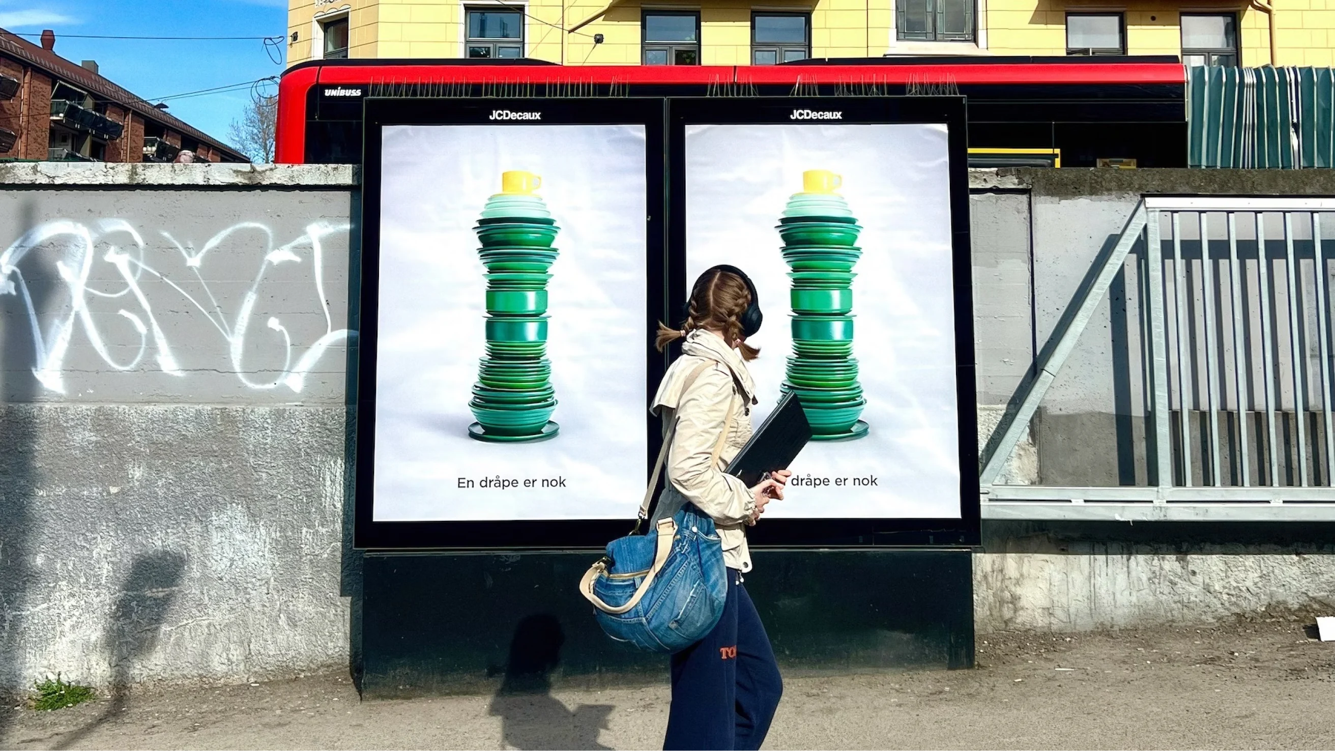
A new advertising campaign for Zalo shows how strong brand assets can communicate effectively, even without a logo, a name or a product shot. I worked as the designer on the ad and was involved throughout the creative process, providing both strategic and visual guidance. I collaborated closely with the creative team and the client to develop a concept that strengthened the brand and delivered its message clearly and effectively.
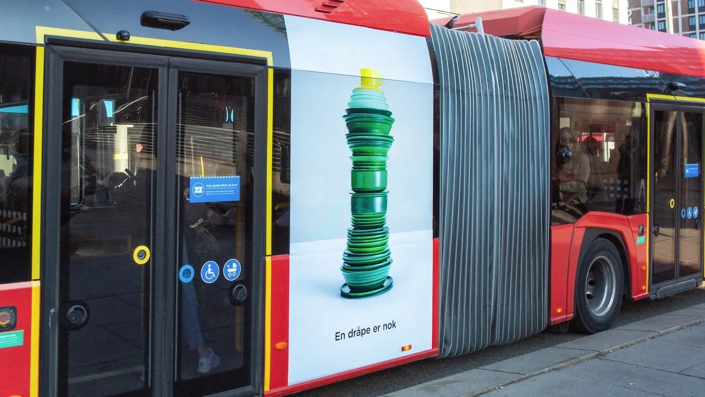
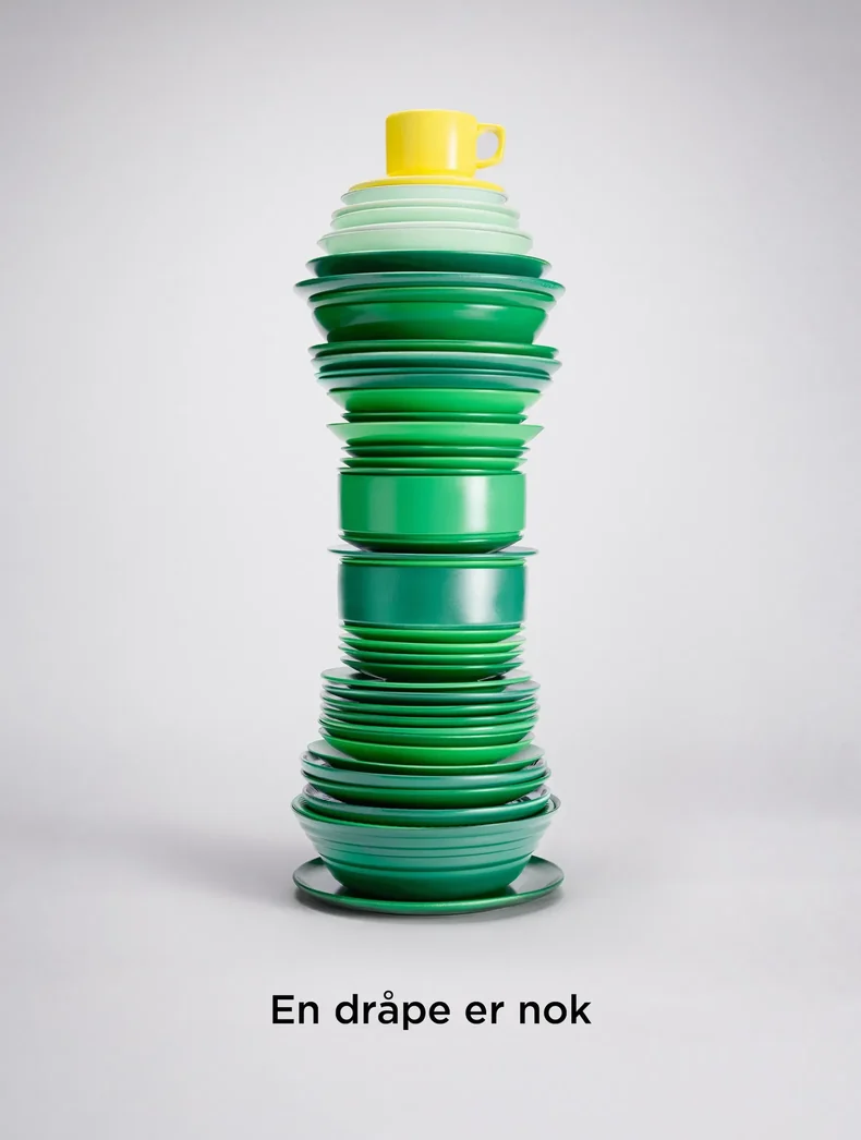
From a graphic design perspective, my main challenge was to identify which visual elements carry the brand on their own, such as colour, form, and the characteristic shapes and details people associate with Zalo, and then give them enough space and weight to do the work a logo normally does. This called for a disciplined approach to reduction. I assessed every element for whether it strengthened or diluted recognition, and built the composition around a clear visual hierarchy so the brand cues would register at a glance.
I also approached the campaign from a UX perspective, treating it as an experience that has to work in a fraction of a second, in real contexts where attention is limited. My aim was to minimise cognitive load and let the audience’s existing mental model of the brand complete the picture. Rather than telling people what they were looking at, the ad invites them to recognise it themselves, which creates a small moment of discovery and a stronger, more memorable connection to the brand.
Through iterative work and continuous sparring with the team, I contributed at both the strategic level and in the visual execution. A key objective for me was to reinforce the elements that make the brand instantly recognisable and relevant to its audience, while making sure the concept worked consistently across formats and channels.